
RavenTrack is an affiliate tracking platform, customised specifically for affiliate marketers in the gaming industry.
Agency
ActiveWin Media
Client
RavenTrack
Date
2020-21
Skills
UI Design, UX Design, UX Research
THE PROBLEM
The platform has had many features added over time. It’s now at the point where users are struggling to perform regular tasks.
My task was: 1- Improve the UX of the product so it’s easier for users to navigate, access the info they need and complete common tasks. 2- Improve the UI to incorporate Raven branding, consider client branding, and improve aesthetics.
THE SOLUTION
UX Research
The Business Goals were, first and foremost, to sell the product. Also, to create a platform that provides all the functionality of competitors but with a better user experience.
KPI’s – Key Metrics were high site usage, low in errors/issues, users able to complete tasks.
Competitor Review – Income Access and Net Refer are the industry heavyweights. Through user interviews, I identified both competitors as having poor user experiences that force users to jump through hoops to complete even the simplest daily tasks.
I also looked at non-competitors that had similar frameworks and functionality: such as Google Analytics and Last Pass. Google provided useful insights into presenting big data and structuring navigation for a large site.
Audience – There were several audience types to consider, defined by their job roles. Each required different tools to complete their daily tasks. These were identified as:
- Admin (RavenTrack staff)
- Clients (affiliate programmes) – Account Managers, Affiliate Managers, Compliance, Finance, Analysts
- Brands (betting companies) – Marketing Managers
- Affiliates
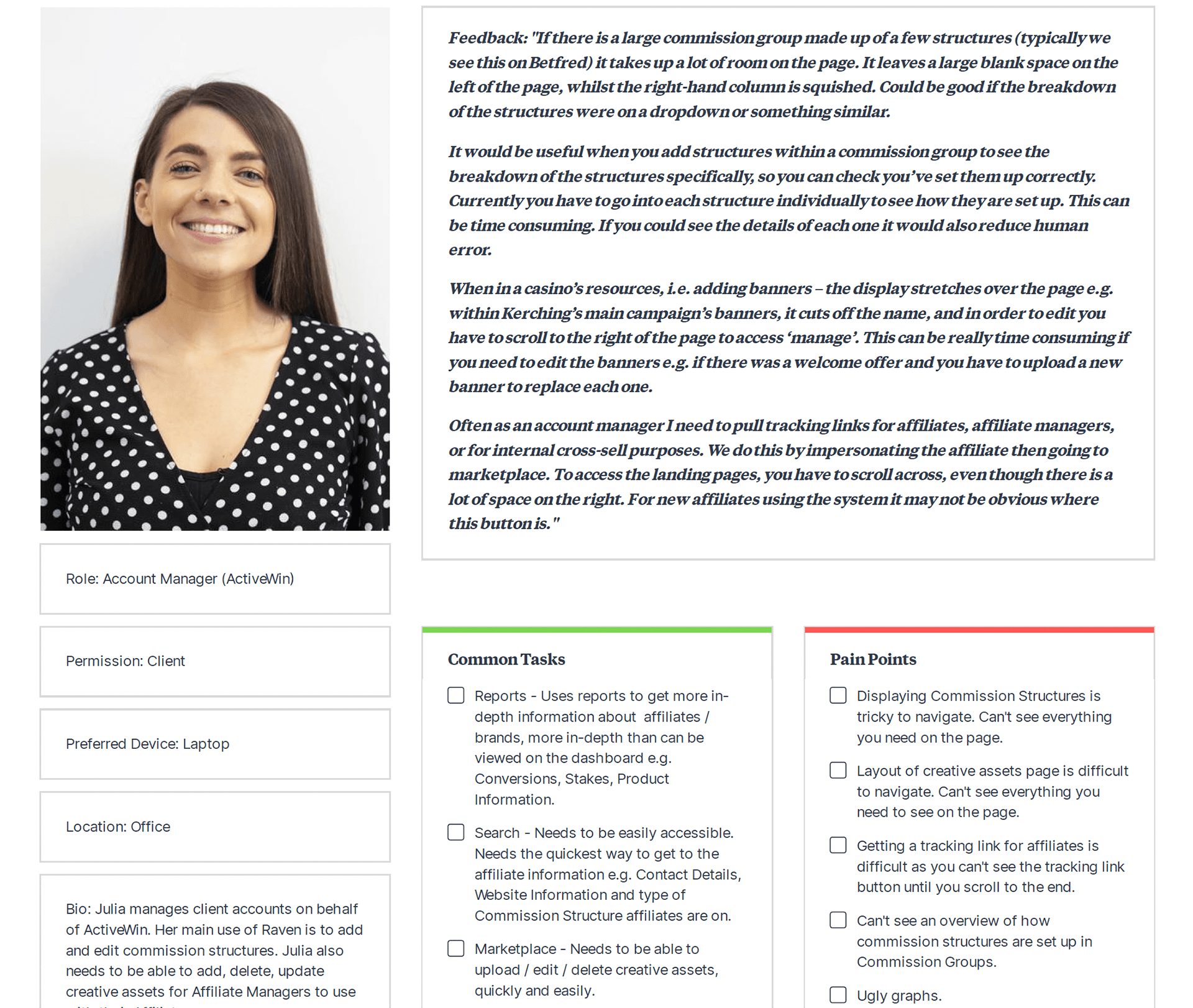
User Interviews/Surveys – Allowed us to discover common tasks and pain points. Big concerns raised in the interviews were: Getting Tracking Links (Reporting) and Accessing Creative (Marketplace). In both cases it was a long-winded process causing the pain.
User Personas – Eight different User Personas were created including an Account Manager, Affiliate Manager, Finance Officer. Common Tasks and Pain Points were gathered from feedback in the user interviews. The personas were a handy tool to refer to whenever a problem needed to be solved at a later stage.
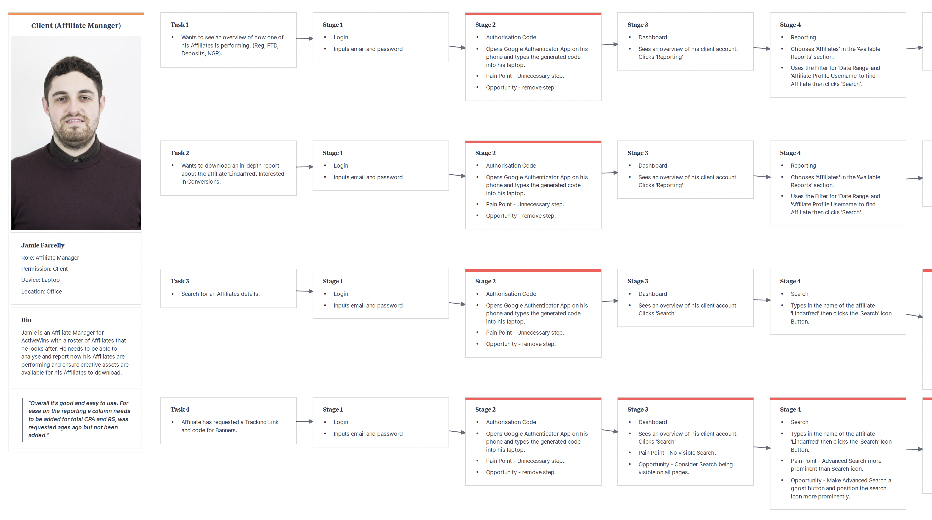
User Journeys – I focused on key tasks that Account Managers and Affiliate Managers must perform. By visualising the steps, it was clear that some tasks (8-13 steps) needed immediate attention.
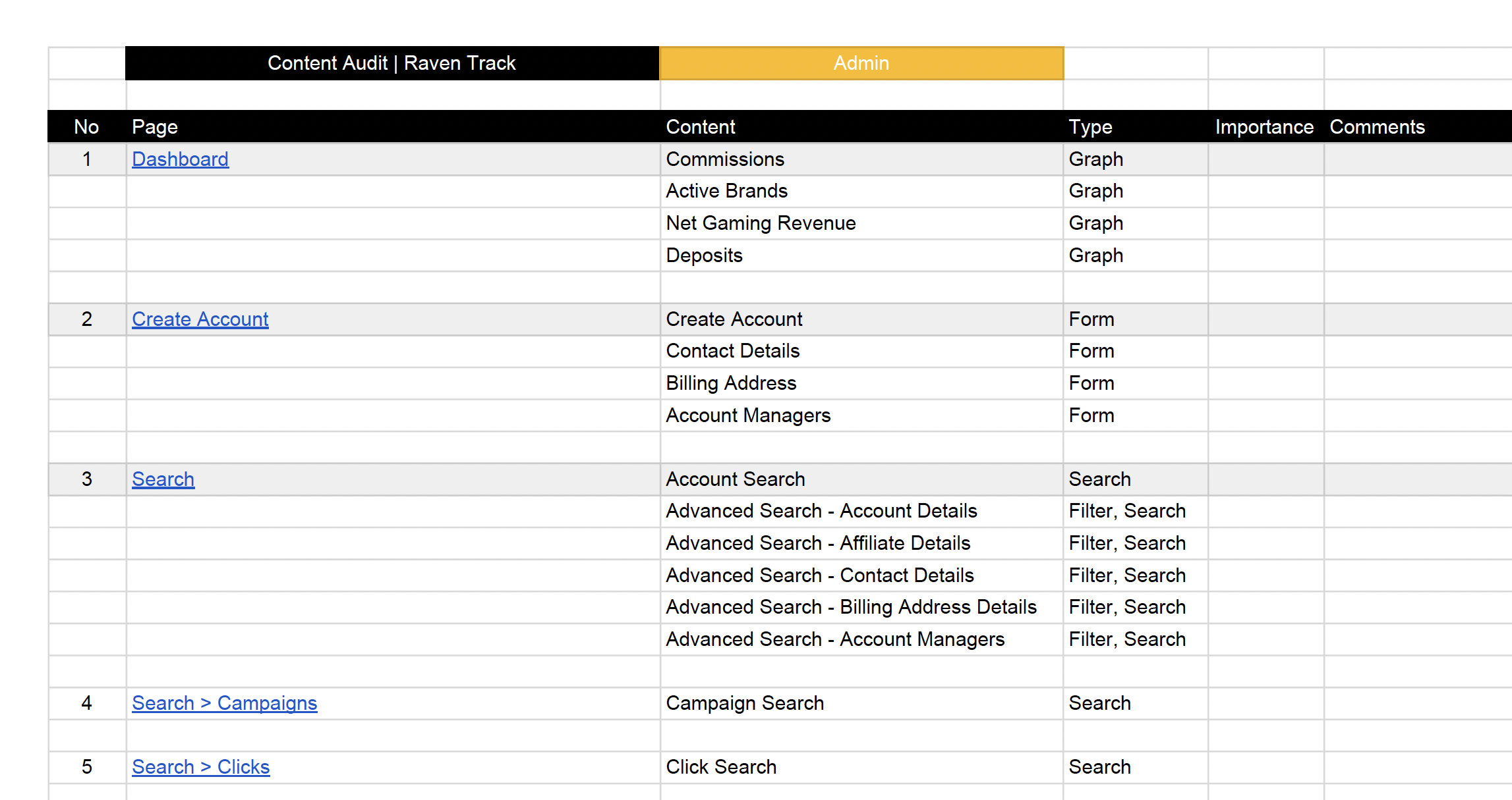
Content Audit – Listing the content and components for each page allows us to review how necessary each is to that page and prioritise each and display them in priority order, top to bottom. It allows us to consider content flow, ensure signposting is in place and the content is aligned to user goals. In this case, completing tasks.
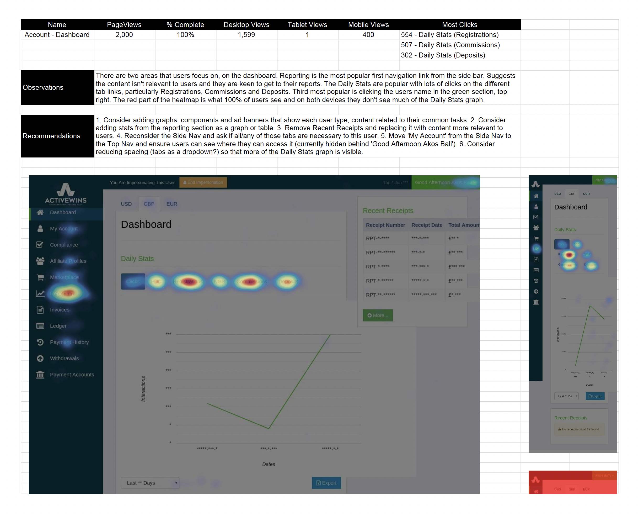
Heatmaps – Provide invaluable insight into user activity. After leaving them running for a couple of weeks, I was able to see the content users like to click as well as the content they don’t click. This data then helped me to make observations and recommendations in a report. (See below)
UX Design
Site Map – I started with the existing site map. There were a lot of sections in the side navigation (13 links in total!). I set about reducing these and renaming them to be more user friendly, using a card sorting exercise to group pages into categories relevant to job roles (‘Affiliate Management’) and common tasks (‘Reporting’, ‘Commission Structures’). Seven sections was much more manageable.
Amazingly, Commission Structures is one of the main tasks on the platform yet the term ‘Commission Structures’ was nowhere to be seen. You had to do a search in order to find that section.
The image comparison below shows the old site map and the new. You can see how we managed to simplify the navigation.
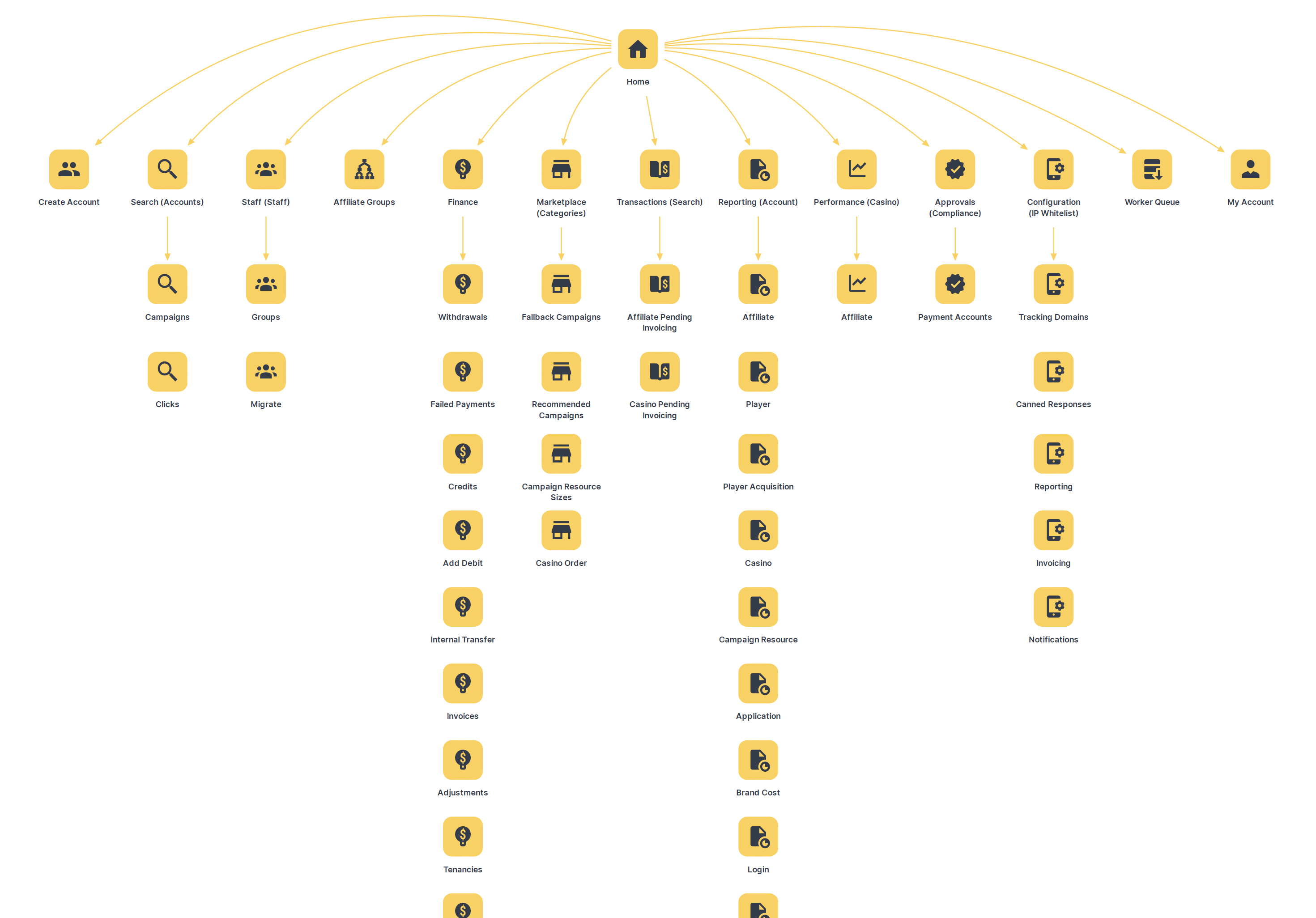
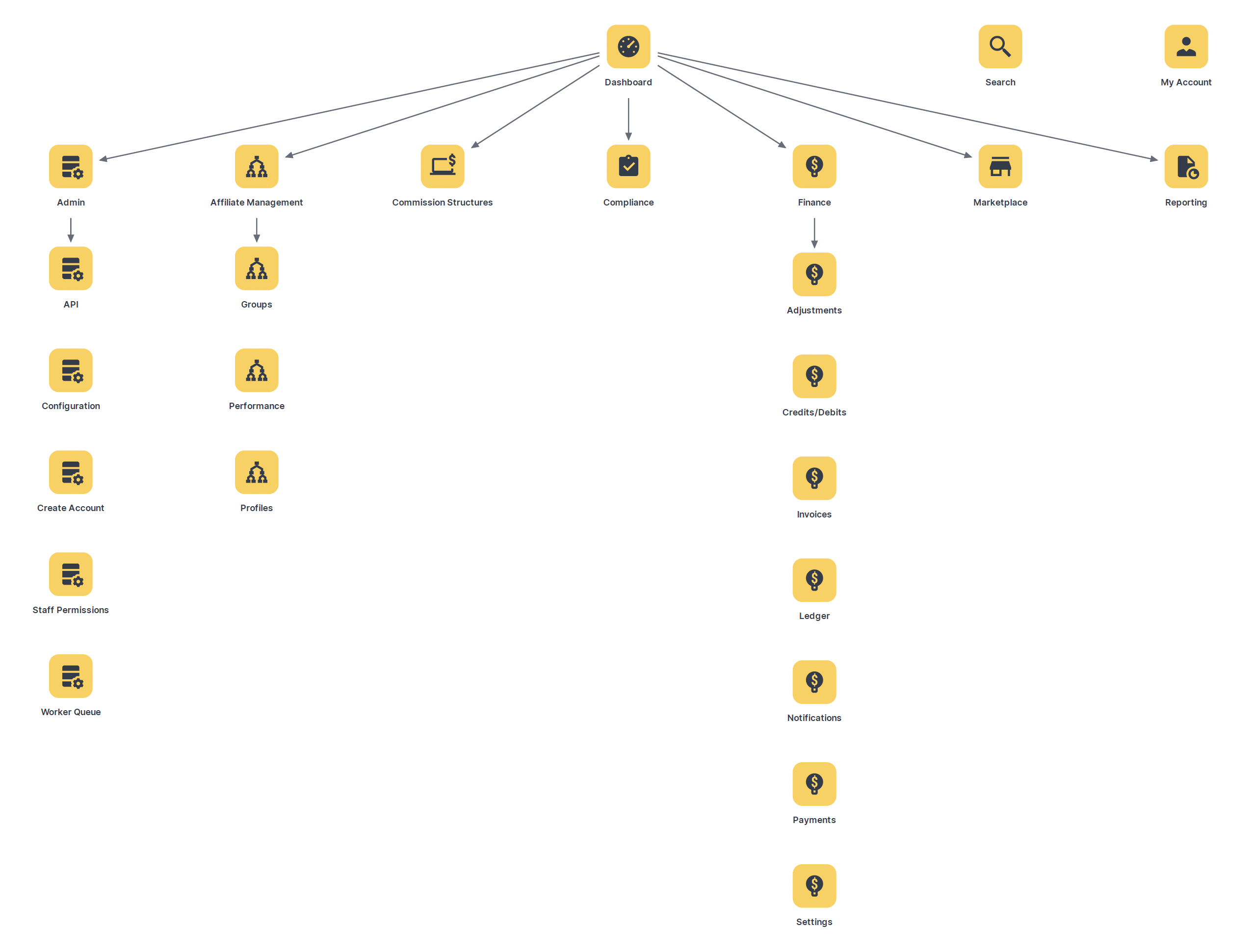
I moved ‘Search’ and ‘My Account’ out of the side navigation and into the main header to a) reduce the nav section options and remove any cognitive overload and b) so Search was always prominent if a user needs it.
I had to identify permission levels (Admin, Clients, Brands, Affiliates) and then produce a site map for each. Instead of users seeing content that didn’t apply to them, we could tailor what each permission level delivered in terms of functionality and content.
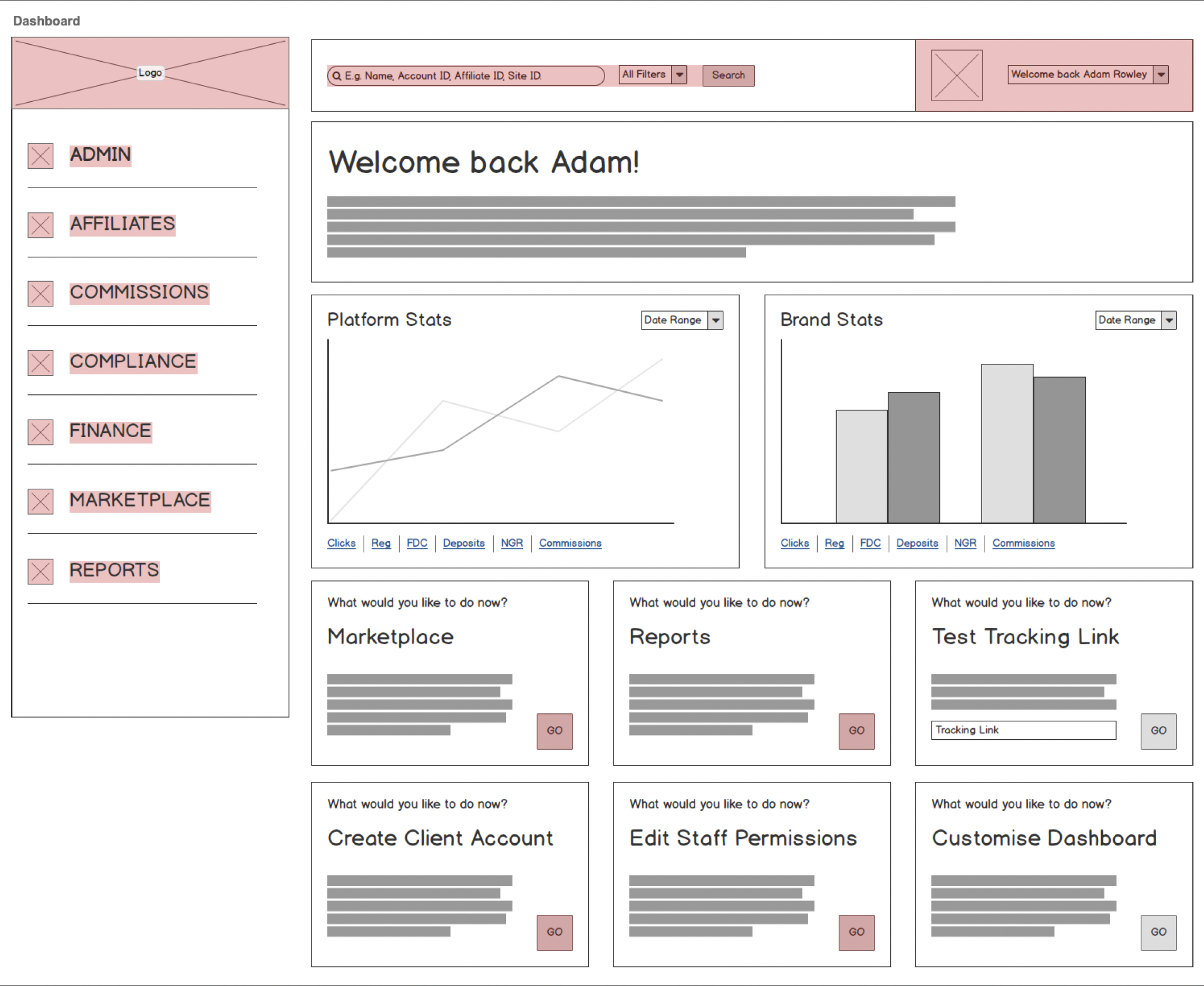
Wireframes – I wireframed the top three levels of navigation plus key user tasks. Using the site map for navigation and content/component lists to fill each page. 49 pages in total. A big task but done much quicker at the wireframe stage than later during UI design or development. The majority of users are on desktop so these wireframes were specifically suited to this device.
Prototypes – Linking all the pages in the Marvel app allowed myself, the client and the developers to test and see how the navigation would work and identify any issues that may arise. Also allowed us to test user journeys and ensure common tasks could be achieved promptly. View Prototype >
UI Design
Mocks – With all the research done and any issues ironed out with the wireframes and prototype, it was time to put the branding ‘bells and whistles’ onto the design.
Sketch is my digital design tool of choice and I start by creating the style guide, adding existing branding such as the logo, colour scheme and text styles. This allows me to see any gaps that might need filling e.g. a logo missing for dark backgrounds, a lack of colours to work with, a lack of web fonts etc.
Using the component list and wireframes as a guide, I then set about designing the components that would make up each page. From forms to graphs, tables to menus and breadcrumbs. Using the Bootstrap 12 column grid as a guide, I provided 3, 4.5, 6, and 9 column versions of the components, to help the client and developers see how they should look on different devices.
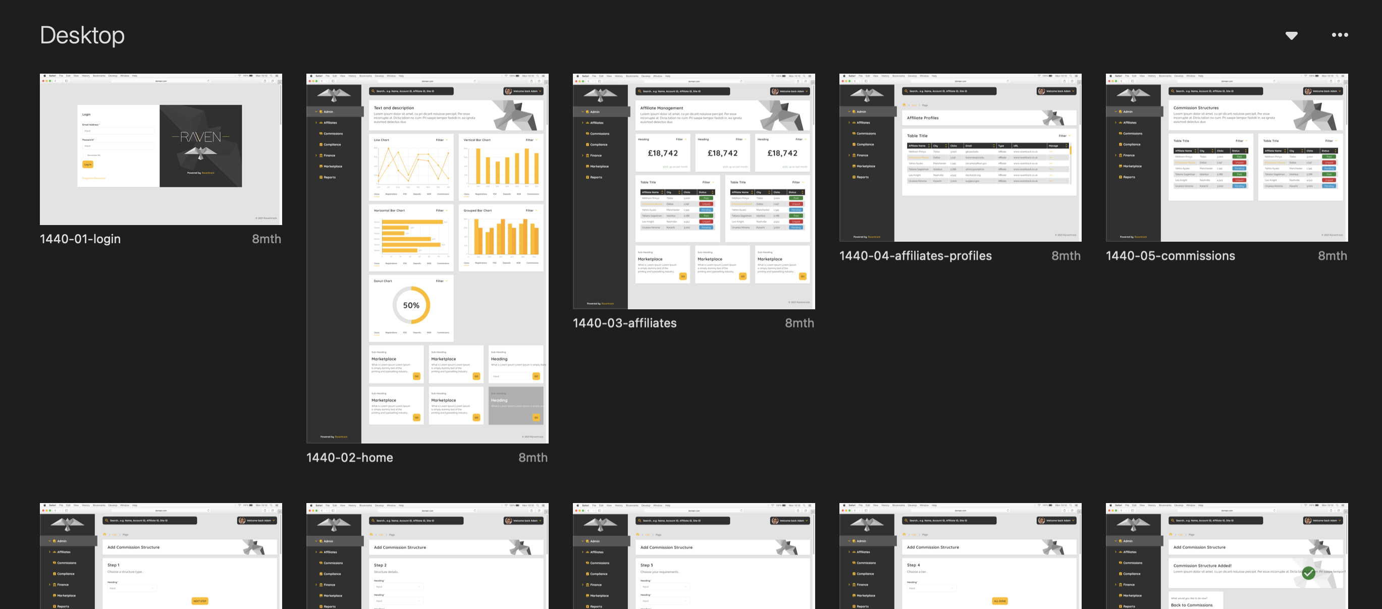
The majority were desktop mocks due to desktop being the preferred device of users. Template pages were designed quickly by adding the components that were designed first. I also mocked a few key user journeys such as adding a commission structure or generating a report.
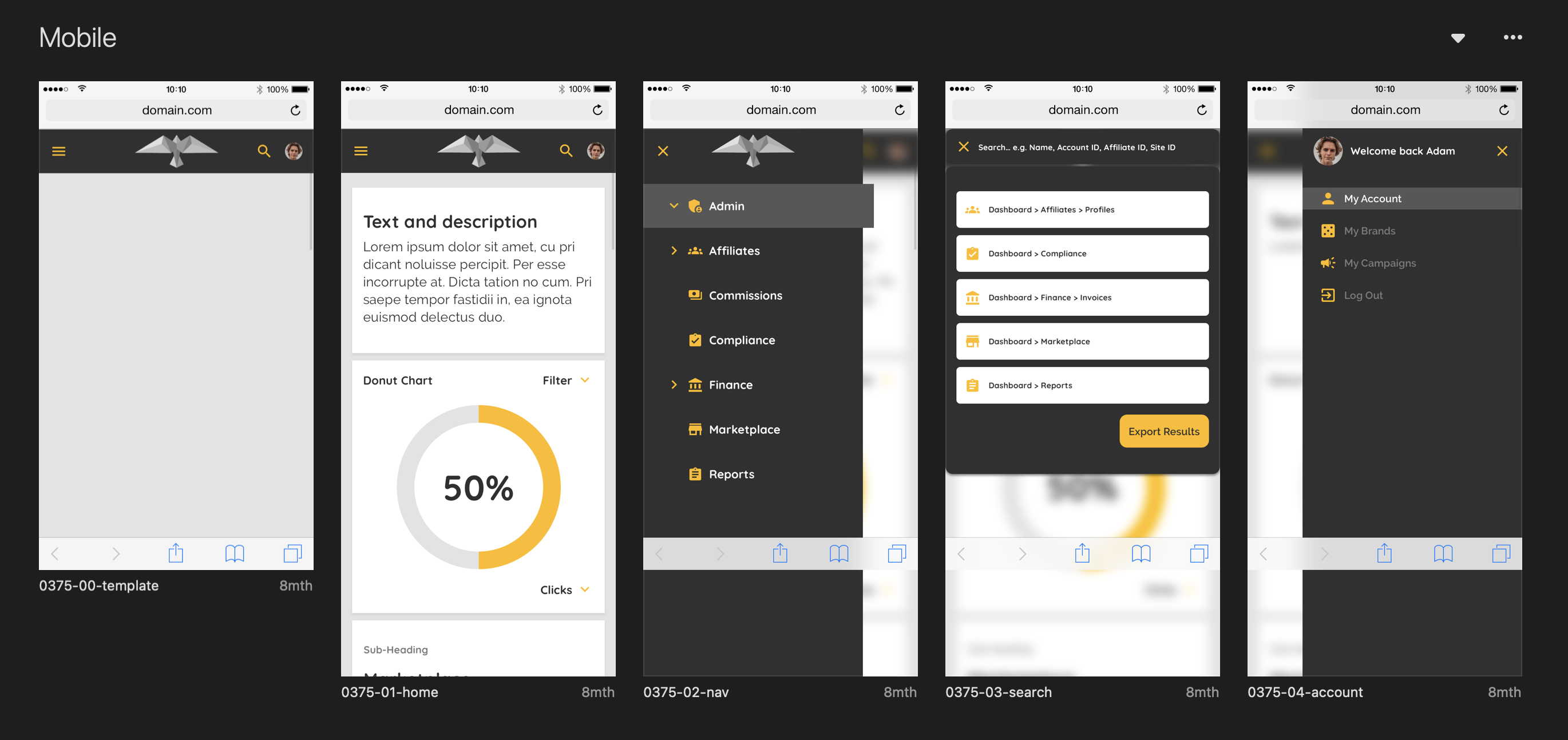
The mobile mocks were simply the home page template, the navigation menu and the 3column components. Just enough to help guide the developers. I’d normally do mobile first but the weight of user data leaned towards desktop along and time constraints led to prioritising desktop.
Assets were exported to Zeplin so Developers could download components or copy & paste the HTML/CSS they needed. I produced a handoff document and then arranged a handoff meeting with the client and the developers to discuss the mocks, explain any interactions that might need to happen, and answer any questions. View Mocks >
RESULTS
- Reduced the steps it takes to generate a report
- Reduced the steps it takes to get a tracking link
- Positive feedback from users
- Client more than happy with the work
- Site in development
”Dave is an exceptional UX Designer. He’s a hard worker, a good communicator and a fantastic designer, who lives and breathes the user experience of everything he works on.
Olly FrayUX & Development Manager