
InVentry are market leaders in digital visitor management and sign-in solutions, used by more than 8,000 schools and businesses.
Agency
ActiveWin Media
Client
Inventry
Date
2019
Skills
UI Design, UX Design
The Challenge
To merge the inventry.co.uk and inventrysoftware.co.uk websites to one website to eliminate website cannibalisation and to centralise focus on inventry.co.uk. Important that the focus was on products and changes did not impact SEO negatively.
MY PROCESS
UX Design
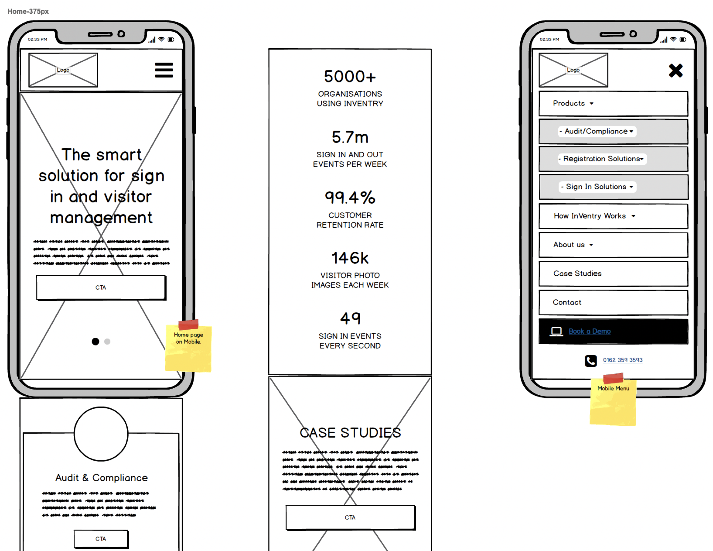
My main focus was on the sitemap, navigation redesign, and homepage redesign.
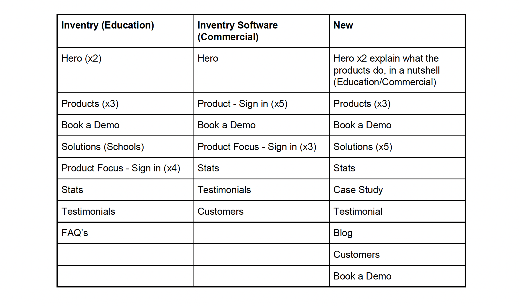
Sitemap – Most of my work on this project was understanding the two sites and then merging duplicate pages, adding pages and then creating a simple navigation flow that aligned with business goals and user goals. There were a lot of pages so it was a case of streamlining where possible and grouping pages in logical sections.
I then briefed the Content team who set about rewriting merged page content, so it wasn’t specific to a particular industry but more general to cover all industries.
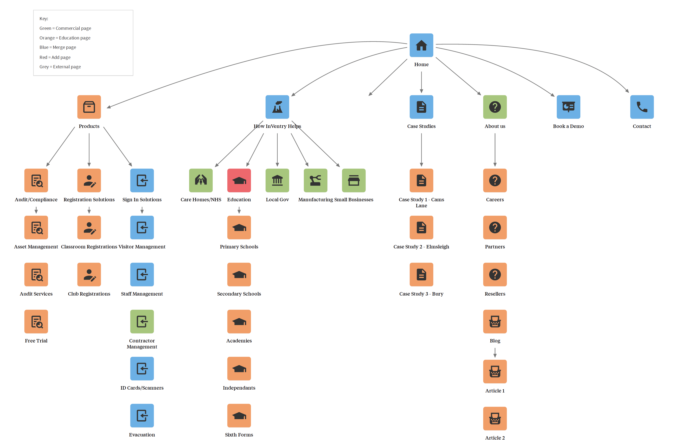
I created a Content Audit for the home page. Noting all the content and components on each homepage and seeing what could be merged, and what could be added (e.g. adding some UX best practices like a social proof component).
I prioritised content and components by business and user goals. As the site is for a UK audience (that reads left to right, top to bottom), I then displayed them on the page with the most important content at the top, least important content at the bottom.
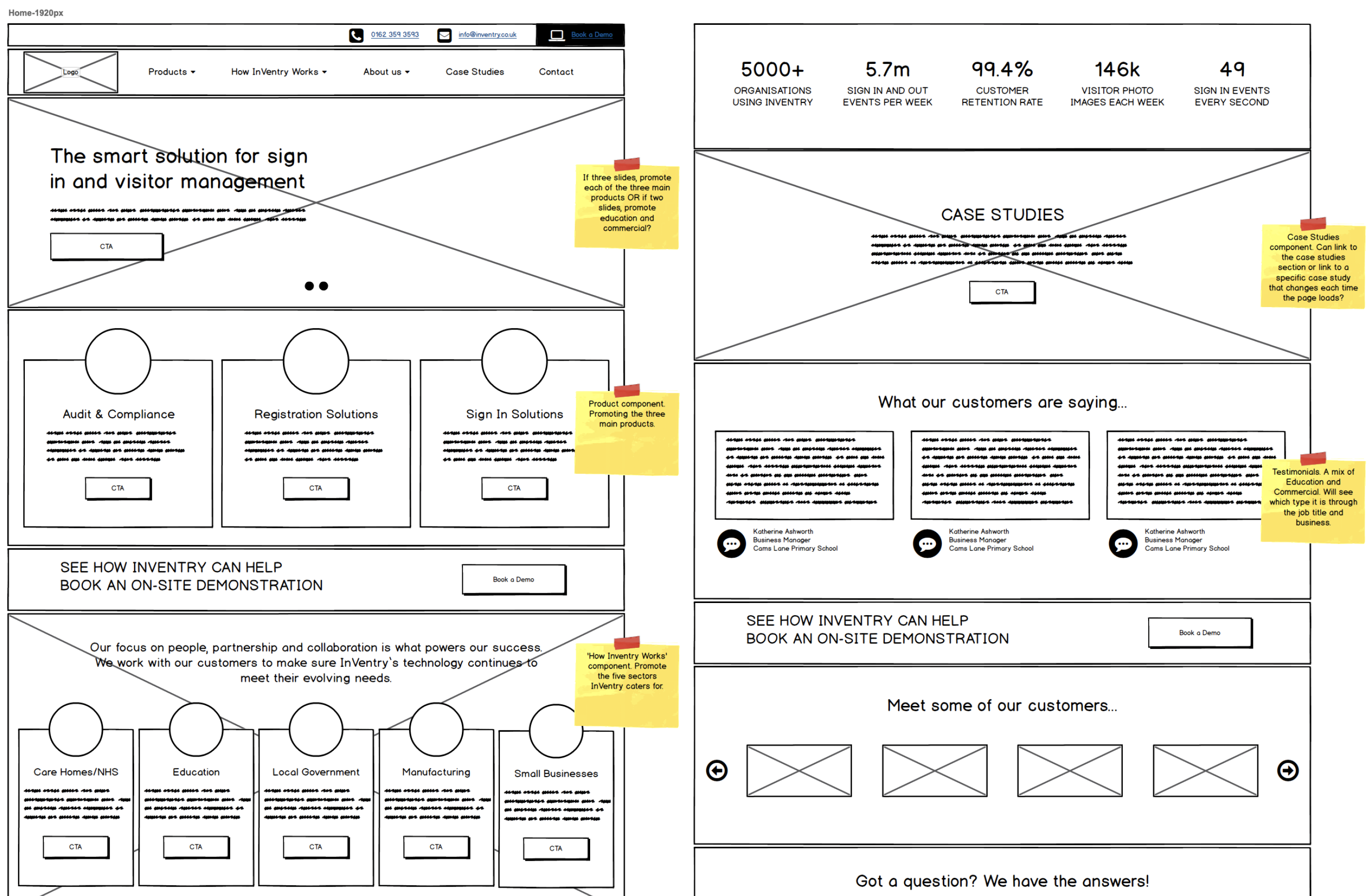
Mobile and Desktop Wireframes were produced for the homepage along with examples of the suggested mega menu (which wasn’t taken up by the client).
We added:
- Contact details to the header
- Turned the Hero into a slider (with options to promote top products OR industry sectors)
- A component to showcase products
- A component to showcase industry sectors
- Stats to showcase the products success and popularity
- Authority provided by case studies and customer logos
- Social proof provided by testimonials
- Signposting to book a demo
- SEO content via an FAQ section
UI Design
Mocks – Time constraints and budget meant only mocking the home page and navigation. Without any branding I had to take colours from Chrome Dev Tools and build up a simple style guide.
I also didn’t have access to original site files, so I had to take screenshots and slice the images or download images from the site and use them as components and reorder the content that way.
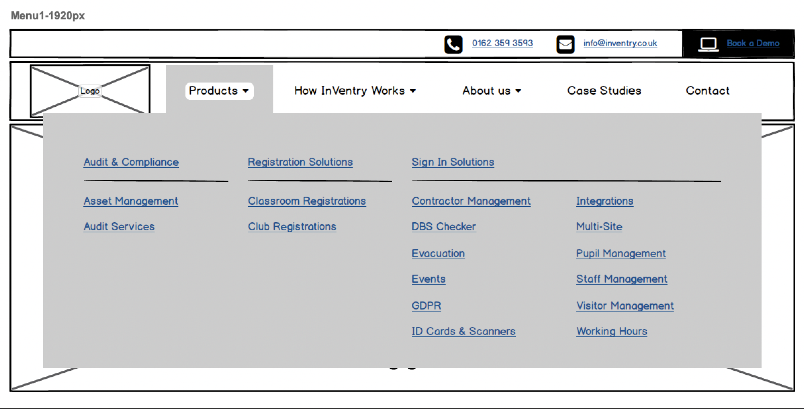
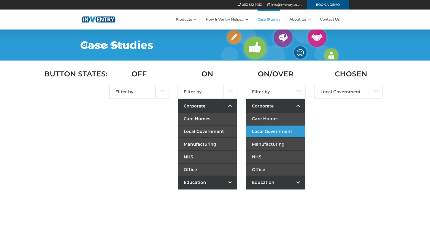
Had to redesign the navigation menu so the development team could see how the dropdown would look and behave. Had to work closely with developers due to the lack of mocks to advise on page structure and ensure brand consistency on the site without having access to any brand guidelines.
Outcomes
- Simple navigation allowed users to find products easily.
- Increase in sales attributed to products being more visible on site.
- Contact details in header helped to increase enquiries and sales.
- Site merge didn’t impact SEO negatively.
- View Website >
”Dave is an exceptional UX Designer. He’s a hard worker, a good communicator and a fantastic designer, who lives and breathes the user experience of everything he works on.
Olly FrayUX & Development Manager